
Machine Learning Powered Biological Network Analysis
Video
Metabolomic network analysis can be used to interpret experimental results within a variety of contexts including: biochemical relationships, structural and spectral similarity and empirical correlation. Machine learning is useful for modeling relationships in the context of pattern recognition, clustering, classification and regression based predictive modeling. The combination of developed metabolomic networks and machine learning based predictive models offer a unique method to visualize empirical relationships while testing key experimental hypotheses. The following presentation focuses on data analysis, visualization, machine learning and network mapping approaches used to create richly mapped metabolomic networks. Learn more at www.createdatasol.com

The following presentation also shows a sneak peak of a new data analysis visualization software, DAVe: Data Analysis and Visualization engine. Check out some early features. DAVe is built in R and seeks to support a seamless environment for advanced data analysis and machine learning tasks and biological functional and network analysis.
As an aside, building the main site (in progress) was a fun opportunity to experiment with Jekyll, Ruby and embedding slick interactive canvas elements into websites. You can checkout all the code here https://github.com/dgrapov/CDS_jekyll_site.
slides: https://www.slideshare.net/dgrapov/machine-learning-powered-metabolomic-network-analysis
Complex Systems Biology Informed Data Analysis
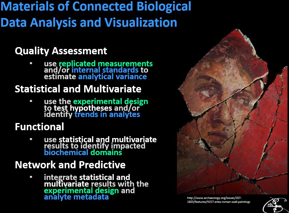 Metabolomics and the greater sphere of ‘Omic analyses are a burgeoning set tools for investigation of environmental and organismal mechanisms and interactions. Carrying out data analyses within complex biological system contexts is rewarding but also difficult. The following presentation considers components involved in conducting multivariate data analysis, modeling and visualization within biological contexts.
slides: https://www.slideshare.net/dgrapov/complex-systems-biology-informed-data-analysis-and-machine-learning
Push it to the limit: SOM + Clustering + Networks
What is the highest dimensional visualization you can think of? Now imagine it being interactive. The following details a Frankenstein visualization packing a smorgasbord of multivariate goodness.
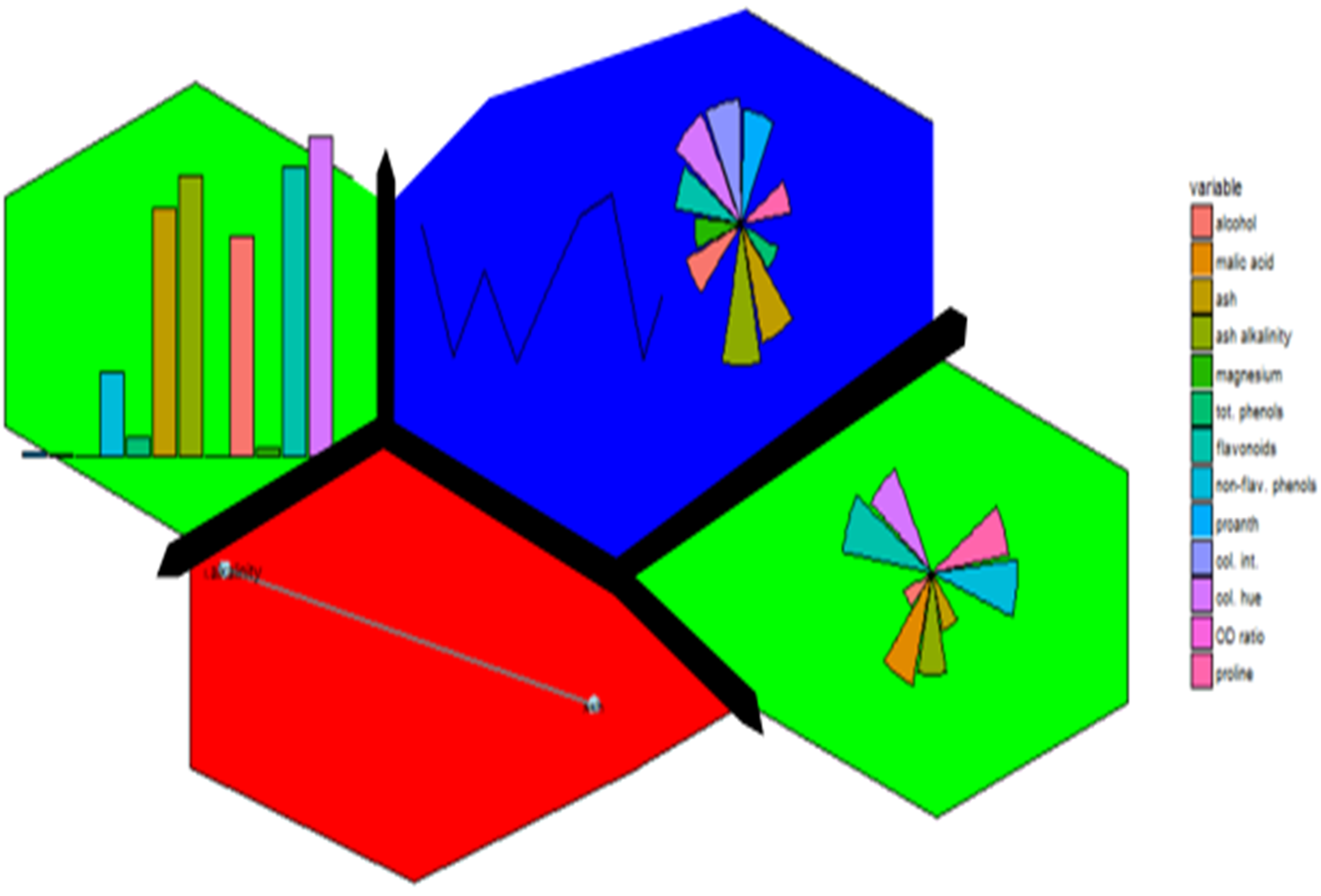
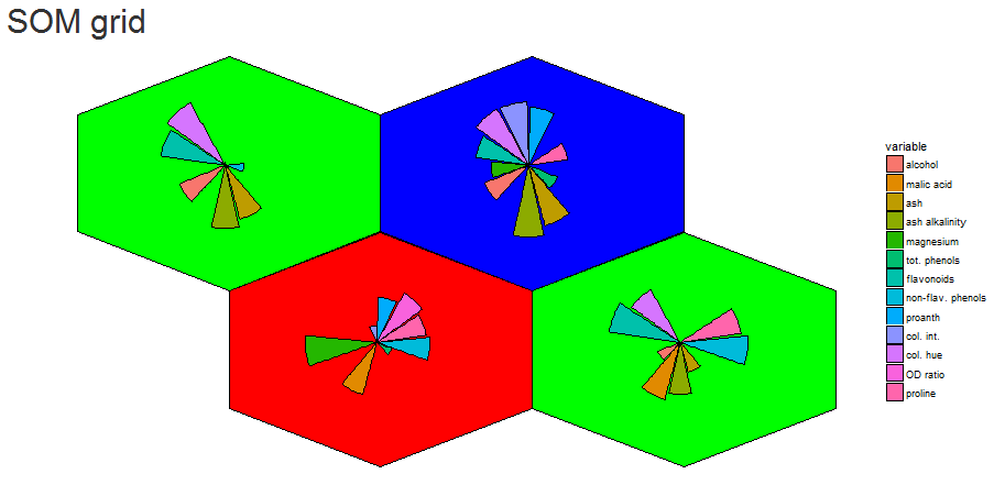
Enter first, self-organizing maps (SOM). I first fell into a love dream with SOMs after using the kohonen package. The wines data set example is a beautiful display of information.
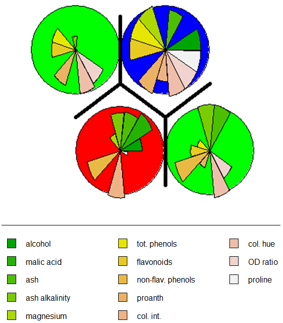
Eloquently, making the visualization above is relatively easy. SOM is used to organize the data into related groups on a grid. Hierarchical cluster analysis (HCA) is used to classify the SOM codes into three groups.
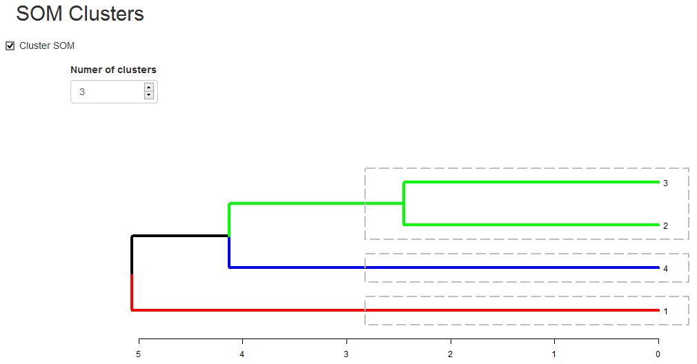
HCA cluster information is mapped to the SOM grid using hexagon background colors. The radial bar plots show the variable (wine compounds’) patterns for samples (wines).
The goal for this project was to reproduce the kohonen.plot using ggplot2 and make it interactive using shiny.
The main idea was to use SOM to calculated the grid coordinates, geom_hexagon for the grid packing and any ggplot for the hexagon-inset sub plots. Some basic inset plots could be bar or line plots.


Part of the beauty is the organization of any ggplot you can think of (optionally grouping the input data or SOM codes) based on the SOM unit classification.
A Pavlovian response might be; does it network?
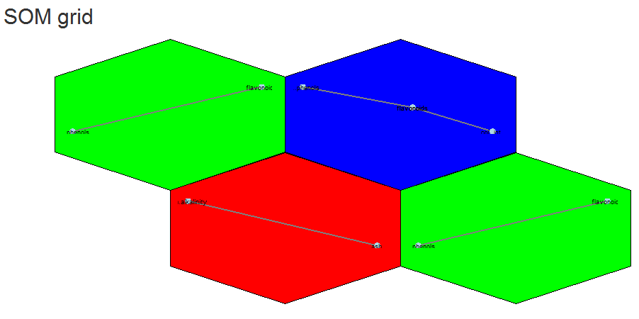
Yes we can (network). Above is an example of different correlation patterns between wine components in related groups of wines. For example the green grid points identify wines showing a correlation between phenols and flavanoids (probably reds?). Their distance from each other could be explained (?) by the small grid size (see below).
The next question might be, does it scale?
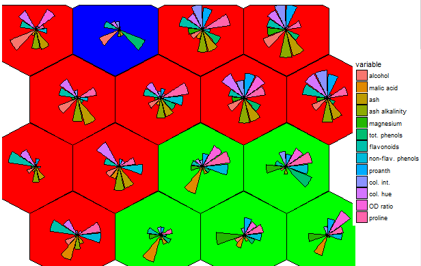
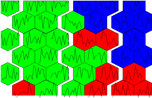
There is potential. The 4 x 4 grid shows radial bar plot patterns for 16 sub groups among the 3 larger sample groups. The next next 6 x 6 plot shows wine compound profiles for 36 ~related subsets of wines.
A useful side effect is that we can use SOM quality metrics to give us an extra-dimensional view into tuning the visualization. For example we can visualize the number of samples per grid point or distances between grid points (dissimilarity in patterns).
This is useful to identify parts of the somClustPlot showing the number of mapped samples and greatest differences.


One problem I experienced was getting the hexagon packing just right. I ended making controls to move the hexagons ~up/down and zoom in/out on the plot. It is not perfect but shows potential (?) for scaffolding highly multivariate visualizations? Some of my other concerns include the stochastic nature of SOM and the need for som random initialization for the embedding. Make sure to use it with set.seed() to make it reproducible, and might want to try a few seeds. Maybe someone out there knows how to make this aspect of SOM more robust?
Try’in to 3D network: Quest (shiny + plotly)
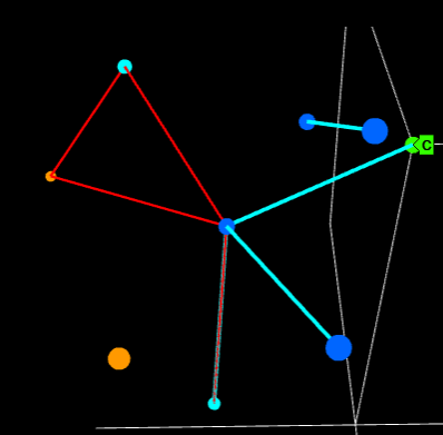
I have an unnatural obsession with 4-dimensional networks. It might have started with a dream, but VR might make it a reality one day. For now I will settle for 3D networks in Plotly.
Presentation: R users group (more)
More: networkly
Network Visualization with Plotly and Shiny
R users: networkly: network visualization in R using Plotly
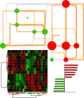
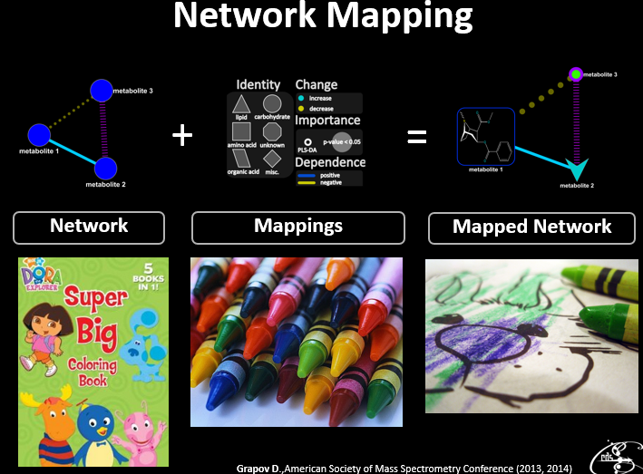
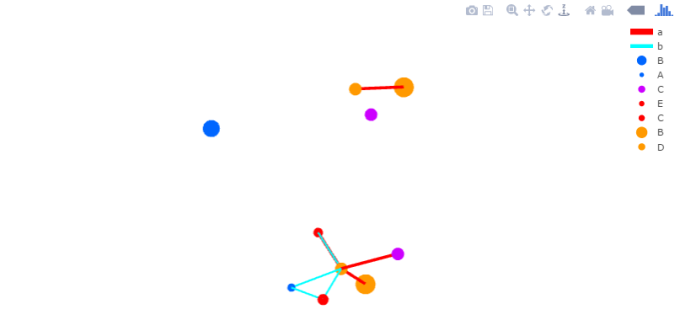
In addition to their more common uses, networks can be used as powerful multivariate data visualizations and exploration tools. Networks not only provide mathematical representations of data but are also one of the few data visualization methods capable of easily displaying multivariate variable relationships. The process of network mapping involves using the network manifold to display a variety of other information e.g. statistical, machine learning or functional analysis results (see more mapped network examples).
The combination of Plotly and Shiny is awesome for creating your very own network mapping tools. Networkly is an R package which can be used to create 2-D and 3-D interactive networks which are rendered with plotly and can be easily integrated into shiny apps or markdown documents. All you need to get started is an edge list and node attributes which can then be used to generate interactive 2-D and 3-D networks with customizable edge (color, width, hover, etc) and node (color, size, hover, label, etc) properties.
2-Dimensional Network (interactive version)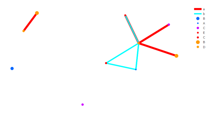
3-Dimensional Network (interactive version)
Data Analysis Workflow: ‘Omics style
Follow along with the presentation and recreate all the analysis results for yourself.
Metabolomics and Beyond: Challenges and Strategies for Next-gen Omic Analyses
Recently I had the pleasure of giving lecture for the Metabolomics Society on Challenges and Strategies for Next-gen Omic Analyses. You can check out all of my slides and video of the lecture below.


New metabolomics manuscript
Read full manuscript,
Systemic Alterations in the Metabolome of Diabetic NOD Mice Delineate Increased Oxidative Stress Accompanied by Reduced Inflammation and Hypertriglyceridemia
.

dplyr Tutorial: verbs + split-apply-combine
At a recent Saint Louis R users meeting I had the pleasure of giving a basic introduction to the awesome dplyr R package. For me, data analysis ubiquitously involves splitting the data based on grouping variable and then applying some function to the subsets or what is termed split-apply-combine. Having personally recently incorporated dplyr into my data wrangling workflows; I’ve found this package’s syntax and performance a joy to work with. My feeling about dplyr are as follows.
Data wrangling without dplyr.

Data wrangling with dplyr.

This tutorial features an introduction to common dplyr verbs and an overview of implementing split-apply-combine in dplyr.
![]()
Some of my conclusions were; not only does dplyr make writing data wrangling code clearer and far faster, the packages calculation speed is also very high (non-sophisticated comparison to base).

The plot above shows the calculation time for 10 replications in seconds (y-axis) for calculating the median of varying number of groups (x-axis), rows (y-facet) and columns (x-facet) with (green line) and without (red line) dplyr.
O-PLS example and trial server
It has been a while since I’ve last posted, but I have been really busy behind the scenes. I set up a shiny server which I am using to host some current apps:
I don’s always keep the trial server running 🙂 so feel free to contact me if you want a private demo.
I’ve also just posted an updated demo for O-PLS using devium functions. One of these days I will make devium and R package for easier loading, but for now you can get everything here (sorry).
Winter 2015 Statistical and Data Analysis Workshop for Metabolomics
![]()
I recently had the pleasure of teaching the Winter 2015 Data analysis for Metabolomics workshop in collaboration with the West Coast Metabolomics Center. This years course featured the newly updated DeviumWeb (v0.4) and MetaMapR (v1.4.0) software. You can check all of the new features for yourself (DeviumWeb, MetaMapR).
I’ve bundled all of the course material to make it easy for anyone to download and follow along. You can download everything from DataAnalysisWorkshop.
2014 Metabolomic Data Analysis and Visualization Workshop and Tutorials
Recently I had the pleasure of teaching statistical and multivariate data analysis and visualization at the annual Summer Sessions in Metabolomics 2014, organized by the NIH West Coast Metabolomics Center.
Similar to last year, I’ve posted all the content (lectures, labs and software) for any one to follow along with at their own pace. I also plan to release videos for all the lectures and labs including use cases for the freely available data analysis software listed below.
You can check out the introduction lecture to the covered material below.
New additions to the course include lecture and lab on Data normalization and updated and improved software.
Software
Stay tuned for videos of all of the material!

2014 Metabolomics Data Analysis and Visualization Tutorials Dmitry Grapov is licensed under a Creative Commons Attribution-NonCommercial-ShareAlike 4.0 International License.
2014 UC Davis Proteomics Workshop
Recently I had the pleasure of teaching data analysis at the 2014 UC Davis Proteomics Workshop. This included a hands on lab for making gene ontology enrichment networks. You can check out my lecture and tutorial below or download all the material.
Introduction
Tutorial
2014 UC Davis Proteomics Workshop Dmitry Grapov is licensed under a Creative Commons Attribution-NonCommercial-ShareAlike 4.0 International License.
PubChem 446220 = Yeyo
![]()
I just updated my R package, CTSgetR, for biological database translation using the Chemical Translation Service (CTS). While making code examples I came across some humorous chemical name synonyms for the molecule referenced in PubChem as CID = 446220. 
Badrock, Bazooka, Bernice, Bernies, Blast, Blizzard, Bouncing Powder, Bump, Burese, C Carrie, Cabello, Candy, Caviar, Cecil, Charlie, Chicken Scratch, Cholly, Coca, Cocktail, Cola, Dama blanca, Dust, Flake, Flex, Florida Snow, Foo Foo, Freeze, Girl, Gold dust, Goofball, Green gold, G-Rock, Happy dust, Happy powder, Happy trails, Heaven, Hell, Jam, Kibbles n’ Bits, Kokan, Kokayeen, Lady, Leaf, Line, Moonrocks, Pimp’s drug, Prime Time, Rock, Sleighride, Snort, Snow (birds), Star dust, Star-spangled powder, Sugar, Sweet Stuff, Toke, Toot, Trails, White girl or lady, Yeyo, Zip

Fig. 1 Immune cell infiltration and beta-cell destruction in prediabetic NOD mice. A Visualization of spatial islet distribution in the context of the vascular network in the intact pancreas. A prediabetic NOD mouse at 27-week. B The body region of the NOD mouse shown in A. Note that substantial beta-cell destruction is observed in the NOD pancreas (i.e. a loss of GFP-expressing beta-cells). C Intraislet capillary network in the body region of a wild-type mouse at 21-week. D Immunohistochemical staining. Insulin (green), glucagon (red), somatostatin (white) and nuclei (blue). E Hypertrophic islet with massive infiltration of T-lymphocytes. (a) Hematoxylin-Eosin (HE) staining of the islet showing peripheral- and intra-islet infiltrating lymphocytes and remaining endocrine islet cells. (b) A serial section stained for CD4-positive lymphocytes by ABC-staining (brown). c A serial section stained for CD8-positive lymphocytes. F Ultrastructural analysis of hypertrophic islets in non-diabetic and diabetic littermates. (a) Non-diabetic male NOD mouse (41-week old, 4-h fasting BG: 136 mg/dL) showing a hyperactive beta-cell with lymphocyte infiltration and vesicles without dense core granules. (b) Beta-cells in diabetic female NOD mouse (40-week old, 4-h fasting BG: 559 mg/dL) appears to be intact despite the presence of ongoing insulitis. G Progressive degradation of endoplasmic reticulum (ER). (a) Well-developed ER (ER) in a beta-cell undergoing insulitis. (b) ER degradation. Ribosomes are detached (shed) from the ER membrane and are aggregated (ER). Nuclear damage is seen with the formation of foam-like structures (N). Immature granules with less dense cores (G) as well as cytoplasmic liquefaction (CL) are observed. (c) ER membrane breakdown. ER membrane breakdown resulted in aggregation of shed ribosomes (ER). An adjacent PP-cell (PP) appears to be intact (identified by characteristic moderately dense cores of pancreatic polypeptide-containing secretory granules). (d) Beta-cell degradation. ER swelling (ER), ribosome shedding, amorphous cytoplasmic material (R) and cytoplasmic, liquefaction (L) are observed in the same beta-cell

Fig. 2 Progression of autoimmune diabetes in NOD mice. A (a) Virtual slice capture of a whole mouse pancreas from mouse insulin promoter I (MIP)-GFP mice on NOD background. (b) Measured beta-cell/islet distribution. (c) Corresponding 3D scatter plot of islet parameters depicts distribution of islets with various sizes and shapes. Each dot represents a single islet. B (a) Representative data showing islet growth in wild-type mice at 20- and 28-week of age. (b) Examples of beta-cell loss at 20-week (non-diabetic) and 28-week (diabetic) in NOD mice. C Heterogeneous beta-cell loss in NOD mice. Frequency is plotted against islet size. D Three distinct groups in the development of T1D in NOD mice. 3D scatter plot showing the relationship among blood glucose levels (BG), total beta-cell area and age. Three groups of mice are color-coded as diabetic mice (red), young mice with normoglycemia (<25 week; green) and old mice with normoglycemia (25–40 week; blue)

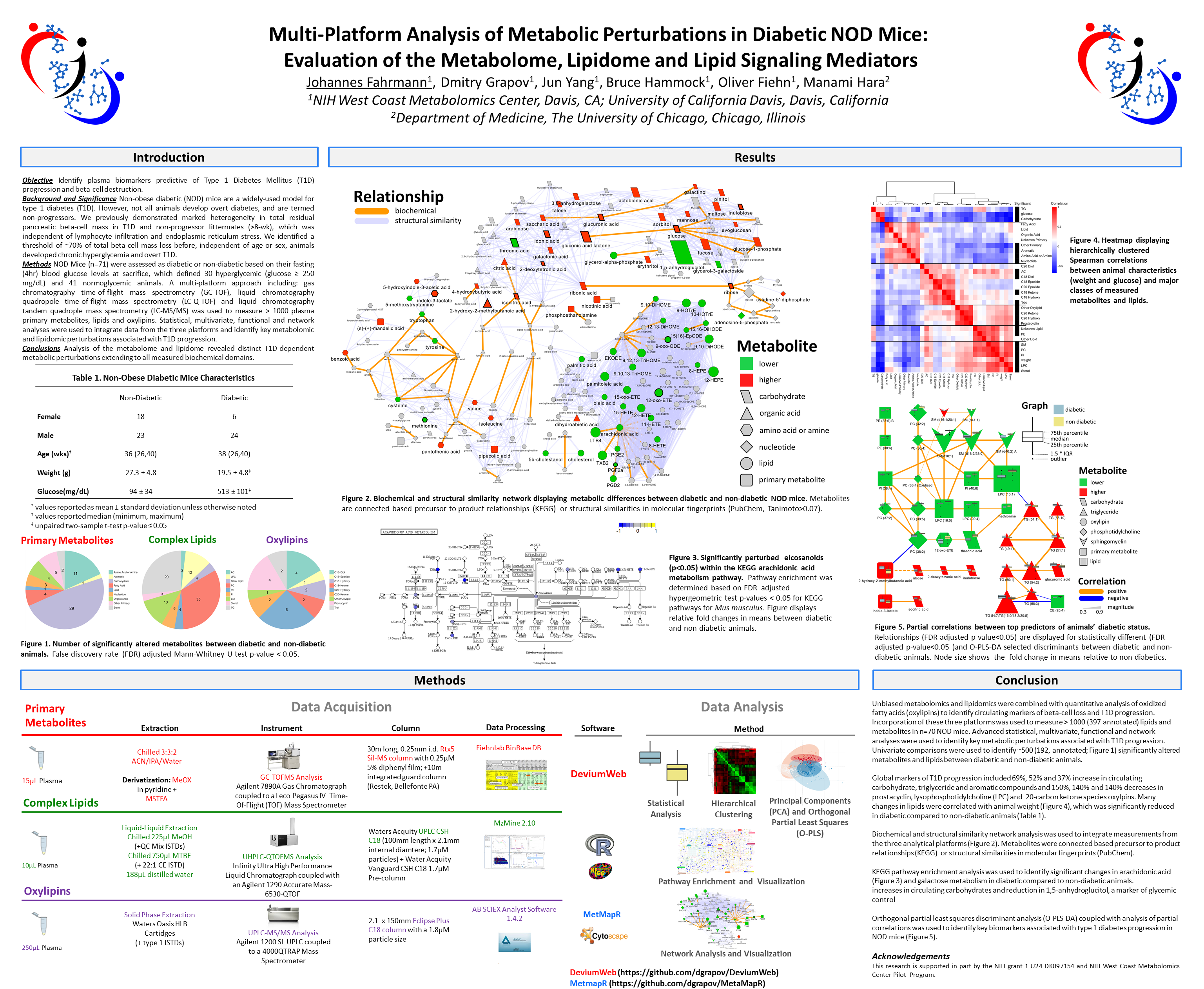
Fig. 3 Biochemical network displaying metabolic differences between diabetic and non-diabetic NOD mice. Metabolites are connected based on biochemical relationships (blue, KEGG RPAIRS) or structural similarity (violet, Tanimoto coefficient ≥0.7). Metabolite size and color represent the importance (O-PLS-DA model loadings, LV 1) and relative change (gray p adj > 0.05; green increase; red decrease) in diabetic compared non-diabetic NOD mice. Shapes display metabolites’ molecular classes or biochemical sub-domains and top descriptors of T1D-associated metabolic perturbations (Table 1) are highlighted with thick black borders

Fig. 4 Partial correlation network displaying associations between all type 1 diabetes-dependent metabolomic perturbations. All significantly altered metabolites (p adj ≤ 0.05, Supplemental Table S3) are connected based on partial correlations (p adj ≤ 0.05). Edge width displays the absolute magnitude and color the direction (orange positive; blue negative) of the partial-coefficient of correlation. Metabolite size and color represent the importance (O-PLS-DA model loadings, LV 1) and relative change (gray p adj > 0.05; green increase; red decrease) in diabetic compared non-diabetic NOD mice. Shapes display metabolites’ molecular classes or biochemical sub-domains (see Fig. 3 legend), and top descriptors of T1D-associated metabolic perturbations (Table 1) are highlighted with thick black borders
In conclusion, we identified marked differences in the rates of progression of NOD mice to T1D. Metabolomic analysis was used to identify age and sex independent metabolic markers, which may explain this heterogeneity. Future studies combining metabolic end points (as they correlate with beta-cell mass) and genetic risk profiles will ultimately lead to a more complete understanding of disease onset and progression.