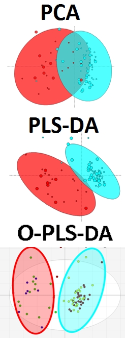
Visualization of Multivariate Biological Models (PLS-DA and O-PLS-DA)

Its not uncommon to be faced by multiple questions at the same time. For instance imagine the following experimental design. You have one MAIN question: what is different between groups A and B, but among groups A and B are subgroups 1 and 2. This complicates things because now the answer to the MAIN question (what is different between A and B) may be slightly different for the two sub groups A|1, A|2 and B|1, B|2.

In statistics we can account for these types of experimental designs by choosing different tests. For instance in the case outlined above we could use a two-way analysis of variance (2-way ANOVA) to identify differences between A|B which are independent of differences between 1|2 (and interaction between A|B and 1|2). In the case of multivariate modeling we can achieve a similar effect by using covariate adjustments. For example we can use the residuals from a simple linear model for differences between 1|2 as the 1|2-effect adjusted data to be used to test for differences between A|B. Here is a visual example of this approach using:
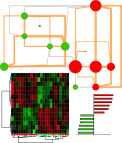
2) 1|2–adjusted PLS-DA model for A|B1) PCA to evaluate the data variance between A and B (GREEN and RED) and 1 and 2 (SMALL or LARGE)
3) 1|2–adjusted O-PLS-DA model for A|B
Based on the PCA we see that the differences between A|B are also affected by 1|2. This is evident in distribution of scores based on LARGE|SMALL among A ( A|1 (GREEN|SMALL) is more different (further right) from all B than A|2 (GREEN|LARGE). The same can be said for B, and in particular the greatest differences between all groups is between those which have the greatest separation in the X-axis (1st principal component) which are RED|LARGE and GREEN|SMALL.
To identify the greatest difference between RED|GREEN which is independent of differences due to SMALL|LARGE, we can use a SMALL|LARGE -adjusted data to create a PLS-DA model to discriminate between RED|GREEN.
This projection of the differences between A|B is the same for SMALL|LARGE groups. Ideally we want the two groups scores to be maximally separated in the X-axis or 1st LV. We see that this is not the case above, and instead the explanation of how the variables contribute to differences between GREEN|RED needs to be answered by explaining scores variance in X and Y axes or two dimensions.
Next we try the O-PLS-DA algorithm, which aims to rotate the projection of the data to maximize the separation between GREEN|RED on the X-axis and capture unrelated or orthogonal variance on the Y-axis.
The O-PLS-DA model loadings for the 1st LV provide information regarding differences in variable magnitudes between the two groups (GREEN|RED).
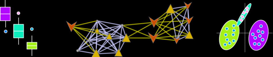
We can use network mapping to visualize these weights within a domain specific context. In the case of metabolomics data this is best achieved using biochemical/chemical similarity networks.
We can create these networks by assigning edges between vertices (representing metabolites) based on biochemical relationships (KEGG RPAIRs ) or chemical similarities (Tanimoto coefficient >0.7). We can then map the O-PLS-DA model loadings to this network’s visual properties (vertex: size, color, border, and inset graphic).

For example we can map vertex size to the matabolite’s importance in the explained discrimination between groups (loading on O-PLS-DA LV 1) and color the direction of change (blue, decrease; red, increase). Metabolites displaying significant differences between RED and GREEN groups (two-way ANOVA, p < 0.05 adjusting for 1|2) are shown at maximum size, with a black border and contain a box-plot visualization.
Here is network mapping the O-PLS-DA model loadings into a biological context and displaying graphs for import parameters means among groups stratified by A|B and 1|2 (left to right: A|1, A|2,B|1,B|2).

Here is another network with the same edge and vertex properties as above, except the inset graphs show differences between groups A|B adjusted for the effect of 1|2.

Anaerobic Stress in Seeds – A Chemical Similarity Network Story
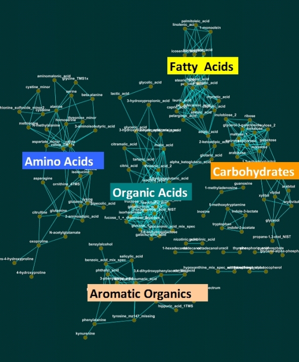
The chemical similarity network or CSN is a great tool for organizing biological data based on known biochemistry or chemical structural similarity. Here is an example CSN for visualizing metabolomic changes (measured via GC/TOF) due to anaerobic stress in germinating seeds.
In this network edges are formed for chemical similarity scores > 75. Node color describes significant (adjusted p-value < 0.05, q-value = 0.05, paired t-Test) increase (red), decrease (blue) or no change (gray) in anaerobic relative to aerobic treatments. Node size is inversely proportional to the tests p-value.
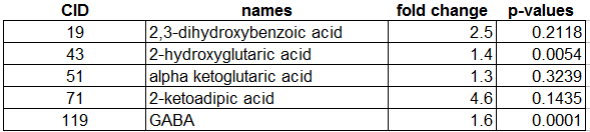
This CSN was not hard to construct and minimally requires knowledge of analyte PubChem chemical identifiers (CIDs). CIDs can be used to calculate the chemical similarity matrix using online tools provided by PubChem. This symmetric matrix can be easily formatted to create an edge list containing the basic information: source, target and similarity score.
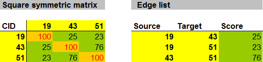
Here is a function for converting square symmetric matrices to edge lists using the R statistical programming environment.
mat.to.edge.list<-function(mat)
{

#accessory function
all.pairs<-function(r,type="one")
   {
    switch(type,
    one = list(first = rep(1:r,rep(r,r))[lower.tri(diag(r))],
    second = rep(1:r, r)[lower.tri(diag(r))]),
    two = list(first = rep(1:r, r)[lower.tri(diag(r))],
    second = rep(1:r,rep(r,r))[lower.tri(diag(r))]))
 ids<-all.pairs(ncol(mat))
 tmp<-as.data.frame(do.call("rbind",lapply(1:length(ids$first) ,function(i)
  {
   value<-mat[ids$first[i],ids$second[i]]
   name<-c(colnames(mat)[ids$first[i]],colnames(mat)[ids$secon   d[i]])
   c(name,value)
  })))
 colnames(tmp)<-c("source","target","value")
 return(tmp)
 }
The function mat.to.edge.list will convert a square symmetric matrix to an edge list through the extraction of the upper triangle excluding the diagonal or self edges.
This edge list can now be visualized as a CSN using some software (see brief instructions here). I prefer to use Cytoscape for this. The edge list merely contains instructions for which vertices or nodes representing metabolites should be connected.
An additional node annotation or attribute table can also be imported into Cytoscape and used to alter the node properties based on statistical results.
Making Chemical Similarity Networks
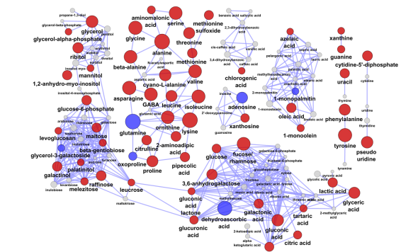
Chemical similarity networks (CSN) can be used to explore multivariate metabolomic data within a biological context. In CSN networks, nodes represent metabolites and edges are formed between metabolite product-to-precursor pairs or structurally similar chemical species.
Here is an example of a chemical similarity network generated from a GC/TOF metabolomic experiment on serum.
This was done following the steps outlined below.
A) Get similarity matrix from pub chem: http://pubchem.ncbi.nlm.nih.gov//score_matrix/score_matrix.cgi
1) paste in CIDs (pubchem ids) in “IDs List”
2) hit submit button on top
3) copy results<–paste below in #2
B) Use Metamapp to generate edge attribute files
1) select chemical and biochemical map option
2) paste in 2 column matrix with CIDs and KEGG ids in field: “Enter CID KEGG Id Pair”
2) paste results from pub chem similarity score in field “Enter Similarity Matrix Data”
C) use KEGG react pairs or network “edge attribute files” to connect metabolites
1) optionally filter connections based on score to select top hits (>75)
2) optionally convert CIDS to metabolite names (need to replace spaces in name with some character, “_”)
3) save as txt or csv file
D) visualize in Cytoscape
1) import table using setting “Network from table (Text/Ms Excel)”
2) select the three columns as 1) source 2) interaction type 3) interaction target
The next thing to do is to
E) annotate node attributes based on statistical test results or biochemical domain knowledge
This is where ExCytR will be very helpful…(to be continued…)
ExCytR Concept
The concept is to make a GUI to provide a static and dynamic linking between data and its network representations.
Static access will involve making networks based on data and metadata stored in some table or spreadsheet.
Dynamic control will provide interactive access to network construction and annotation properties.
Together, these will provide rapid generation of information rich networks, based on tests of internal data properties or from exogenous semantic knowledge. Here is an example of a network representation of a time course metabolomic experiment. This network is used to encode dependence between top parameters of a PLS-DA model discriminating between pre- and post-experimental interventions. Larger nodes show variables meeting the 5% significance cut off (p < 0.05) for a mixed effects model to identify intervention related differences between unbalanced baseline and area under the curve for metabolite excursion measurements during an oral glucose tolerance test (OGTT). Node color signifies increase (red) or decrease (blue) in post- relative to pre-intervention average values. Node shape and outline display metabolite classification and presence in a PLS-DA model respectively. Node graphs, created in ggplots2, show box plots for pre- (red) and post-intervention (green) class distribution medians, upper and lower quartiles, and outliers.
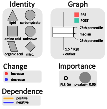
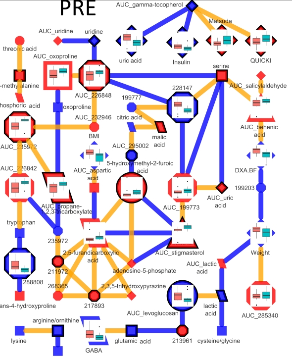
The interactions between model parameters which exist only in pre-intervention samples are shown in the network below.
Connections are made between metabolites which have a non-zero partial correlation extracted based on a qpnetwork trimmed at a threshold where node and edge number is ~equal. In this network all edges meet the 5% significance based on tests of persons correlations.
Excel + Cytoscape + R = ExCytR
My new project is coming along nicely and should be released early 2013. It builds on the structures developed in imDEV to link Excel, Cytoscape and R using RExcel, RCytoscape, and CytoscapeRPC . This trio can be used to rapidly generate beautiful and informative network representations of data.
Here is an example of a undirected Gaussian graphical Markov metabolic network calculated from time course metabolomic measurements generated by gas chromatography time-of-flight mass spectrometry (GC/TOF).
Nodes represent metabolomic variables whose characteristics encode chemometric data and the results of statistical analyses and multivariate modeling. Ggplot2 is used to generate graphs of the time course data representing the means and standard error of metaboloite concentrations in two study populations. The connections between nodes or edges are calculated from q-order partial correlations using the R package qpgraph.