2014 Metabolomic Data Analysis and Visualization Workshop and Tutorials
Recently I had the pleasure of teaching statistical and multivariate data analysis and visualization at the annual Summer Sessions in Metabolomics 2014, organized by the NIH West Coast Metabolomics Center.
Similar to last year, I’ve posted all the content (lectures, labs and software) for any one to follow along with at their own pace. I also plan to release videos for all the lectures and labs including use cases for the freely available data analysis software listed below.
You can check out the introduction lecture to the covered material below.
New additions to the course include lecture and lab on Data normalization and updated and improved software.
Software
Stay tuned for videos of all of the material!

2014 Metabolomics Data Analysis and Visualization Tutorials Dmitry Grapov is licensed under a Creative Commons Attribution-NonCommercial-ShareAlike 4.0 International License.
2014 UC Davis Proteomics Workshop
Recently I had the pleasure of teaching data analysis at the 2014 UC Davis Proteomics Workshop. This included a hands on lab for making gene ontology enrichment networks. You can check out my lecture and tutorial below or download all the material.
Introduction
Tutorial
2014 UC Davis Proteomics Workshop Dmitry Grapov is licensed under a Creative Commons Attribution-NonCommercial-ShareAlike 4.0 International License.
Using Repeated Measures to Remove Artifacts from Longitudinal Data
Recently I was tasked with evaluating and most importantly removing analytical variance form a longitudinal metabolomic analysis carried out over a few years and including >2,5000 measurements for >5,000 patients. Even using state-of-the-art analytical instruments and techniques long term biological studies are plagued with unwanted trends which are unrelated to the original experimental design and stem from analytical sources of variance (added noise by the process of measurement). Below is an example of a metabolomic measurement with and without analytical variance.

The noise pattern can be estimated based on replicated measurements of quality control samples embedded at a ratio of 1:10 within the larger experimental design. The process of data normalization is used to remove analytical noise from biological signal on a variable specific basis. At the bottom of this post, you can find an in-depth presentation of how data quality can be estimated and a comparison of many common data normalization approaches. From my analysis I concluded that a relatively simple LOESS normalization is a very powerful method for removal of analytical variance. While LOESS (or LOWESS), locally weighted scatterplot smoothing, is a relatively simple approach to implement; great care has to be taken when optimizing each variable-specific model.
In particular, the span parameter or alpha controls the degree of smoothing and is a major determinant if the model (calculated from repeated measures) is underfit, just right or overfit with regards to correcting analytical noise in samples. Below is a visualization of the effect of the span parameter on the model fit.

One method to estimate the appropriate span parameter is to use cross-validation with quality control samples. Having identified an appropriate span, a LOESS model can be generated from repeated measures data (black points) and is used to remove the analytical noise from all samples (red points).

Having done this we can now evaluate the effect of removing analytical noise from quality control samples (QCs, training data, black points above) and samples (test data, red points) by calculating the relative standard deviation of the measured variable (standard deviation/mean *100). In the case of the single analyte, ornithine, we can see (above) that the LOESS normalization will reduce the overall analytical noise to a large degree. However we can not expect that the performance for the training data (noise only) will converge with that of the test set, which contains both noise and true biological signal.
In addition to evaluating the normalization specific removal of analytical noise on a univariate level we can also use principal components analysis (PCA) to evaluate this for all variables simultaneously. Below is an example of the PCA scores for non-normalized and LOESS normalized data.

We can clearly see that the two largest modes of variance in the raw data explain differences in when the samples were analyzed, which is termed batch effects. Batch effects can mask true biological variability, and one goal of normalizations is to remove them, which we can see is accomplished in the LOESS normalized data (above right).
However be forewarned, proper model validation is critical to avoiding over-fitting and producing complete nonsense.

In case you are interested the full analysis and presentation can be found below as well as the majority of the R code used for the analysis and visualizations.
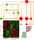
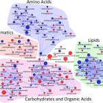
High Dimensional Biological Data Analysis and Visualization
High dimensional biological data shares many qualities with other forms of data. Typically it is wide (samples << variables), complicated by experiential design and made up of complex relationships driven by both biological and analytical sources of variance. Luckily the powerful combination of R, Cytoscape (< v3) and the R package RCytoscape can be used to generate high dimensional and highly informative representations of complex biological (and really any type of) data. Check out the following examples of network mapping in action or view a more indepth presentation of the techniques used below.
Partial correlation network highlighting changes in tumor compared to control tissue from the same patient.

Biochemical and structural similarity network of changes in tumor compared to control tissue from the same patient.

Hierarchical clusters (color) mapped to a biochemical and structural similarity network displaying difference before and after drug administration.

Partial correlation network displaying changes in metabolite relationships in response to drug treatment.

Partial correlation network displaying changes in disease and response to drug treatment.

Check out the full presentation below.
Tutorials- Statistical and Multivariate Analysis for Metabolomics
 I recently had the pleasure in participating in the 2014 WCMC Statistics for Metabolomics Short Course. The course was hosted by the NIH West Coast Metabolomics Center and focused on statistical and multivariate strategies for metabolomic data analysis. A variety of topics were covered using 8 hands on tutorials which focused on:
- data quality overview
- statistical and power analysis
- clustering
- principal components analysis (PCA)
- partial least squares (O-/PLS/-DA)
- metabolite enrichment analysis
- biochemical and structural similarity network construction
- network mapping
I am happy to have taught the course using all open source software, including: R, and Cytoscape. The data analysis and visualization were done using Shiny-based apps: DeviumWeb and MetaMapR. Check out some of the slides below or download all the class material and try it out for yourself.
2014 WCMC LC-MS Data Processing and Statistics for Metabolomics by Dmitry Grapov is licensed under a Creative Commons Attribution-NonCommercial-ShareAlike 4.0 International License.
Special thanks to the developers of Shiny and Radiant by Vincent Nijs.
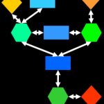
Introduction to Network Mapping
 Network mapping is a high-dimensional data visualization technique which can be applied to virtually any type of data. I recently gave a tutorial on the basics of network mapping where each participants generated a mapped network for their name.
Download the full tutorial at TeachingDemos, and then follow along with the tutorial at your own pace.
Happy network mapping!
Tutorials Covering Biological Data Analysis Strategies
I’ve posted two new tutorials focused on intermediate and advanced strategies for biological, and specifically metabolomic data analysis (click titles for pdfs).

TeachingDemos
In an effort to spread the word on how easy it is to make amazing data visualizations and harness the power of the internet to do science I’ve started a new repository for Biological and Multivariate Data Analysis Tutorials: TeachingDemos.

Data Base query and translation
- Translating Between Chemical Identifiers (intermediate)
Check out an application of my two new R packages, CTSgetR and CIRgetR, for translation between chemical identifiers in R using the Chemical Translation Service (CTS) and Chemical Identifier Resolver CIR.
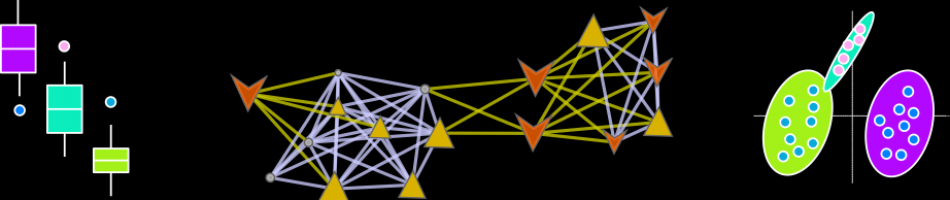
Multivariate Analysis
- Principal Components Analysis (PCA) (fast and simple)
- Partial Least Squares (PLS) (fast and simple)
Network Visualizations
Tutorial- Building Biological Networks
I love networks! Nothing is better for visualizing complex multivariate relationships be it social, virtual or biological.
I recently gave a hands-on network building tutorial using R and Cytoscape to build large biological networks. In these networks Nodes represent metabolites and edges can be many things, but I specifically focused on biochemical relationships and chemical similarities. Your imagination is the limit.


If you are interested check out the presentation below.
Here is all the R code and links to relevant data you will need to let you follow along with the tutorial.
</pre>
#load needed functions: R package in progress - "devium", which is stored on github
source("http://pastebin.com/raw.php?i=Y0YYEBia")
<pre>
# get sample chemical identifiers here:https://docs.google.com/spreadsheet/ccc?key=0Ap1AEMfo-fh9dFZSSm5WSHlqMC1QdkNMWFZCeWdVbEE#gid=1
#Pubchem CIDs = cids
cids # overview
nrow(cids) # how many
str(cids) # structure, wan't numeric
cids<-as.numeric(as.character(unlist(cids))) # hack to break factor

#get KEGG RPAIRS
#making an edge list based on CIDs from KEGG reactant pairs
KEGG.edge.list<-CID.to.KEGG.pairs(cid=cids,database=get.KEGG.pairs(),lookup=get.CID.KEGG.pairs())
head(KEGG.edge.list)
dim(KEGG.edge.list) # a two column list with CID to CID connections based on KEGG RPAIS
# how did I get this?
#1) convert from CID to KEGG using get.CID.KEGG.pairs(), which is a table stored:https://gist.github.com/dgrapov/4964546
#2) get KEGG RPAIRS using get.KEGG.pairs() which is a table stored:https://gist.github.com/dgrapov/4964564
#3) return CID pairs

#get EDGES based on chemical similarity (Tanimoto distances >0.07)
tanimoto.edges<-CID.to.tanimoto(cids=cids, cut.off = .7, parallel=FALSE)
head(tanimoto.edges)
# how did I get this?
#1) Use R package ChemmineR to querry Pubchem PUG to get molecular fingerprints
#2) calculate simialrity coefficient
#3) return edges with similarity above cut.off

#after a little bit of formatting make combined KEGG + tanimoto edge list
# https://docs.google.com/spreadsheet/ccc?key=0Ap1AEMfo-fh9dFZSSm5WSHlqMC1QdkNMWFZCeWdVbEE#gid=2

#now upload this and a sample node attribute table (https://docs.google.com/spreadsheet/ccc?key=0Ap1AEMfo-fh9dFZSSm5WSHlqMC1QdkNMWFZCeWdVbEE#gid=1)
#to Cytoscape
You can also download all the necessary materials HERE, which include:
- tutorial in powerpoint
- R script
- Network edge list and node attributes table
- Cytoscape file
Happy network making!